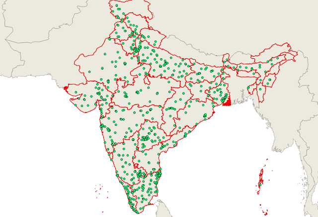
In this post, I will demonstrate how to wrangle and map the ‘list of colleges teaching MBBS in India’. The list is available on this webpage.
First I will collected the dataset, clean it into a GIS friendly format, geocode the colleges, then map it on the map of India sourced from GADM. This is a project you could 100% complete without coding using tools like QGIS or ArcGIS, but here I will use python code to do it from scratch.
Data collection
Lets collect the list of data from the web page into CSV file. There are ways to do this in python like using requests module, selenium module, beautifulsoup module, scrapy module etc.
In this situation, I will copy the html element the represent the table into a local file, then extract the table from the local CSV spreadsheet using python.
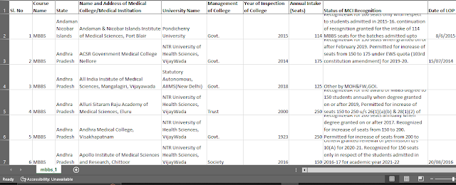
Using pandas library, with few lines of code we got the list into a CSV file as seen below;-
mbbs_df = pd.read_html(r"mbbs.html")
mbbs_df[0].to_csv(r"mbbs.csv", index=False)
mbbs_df = mbbs_df[0]

mbbs_df
Geocode the colleges
Next lets geocode the addresses. As always, there are several ways to do it. Here I will use an API provided by OpenCageData. Other geocoding API that could be used are Google Geocode, Bing Geocode, MapQuest Geocode, OpenStreetMap Geocoder etc
Create an account on OpenCageData, the free plan will serve our purpose. The API documentation page has useful example to get you started in no time. One reason why I prefer the OpenCageData API over other options is that the API call returns lot more useful information (they call them 'annotations') than just the latitude and longitude of the address. Some of these information are: 'DMS', 'MGRS', 'Maidenhead', 'Mercator', 'OSM', 'geohash', 'qibla', 'roadinfo', 'sun', 'timezone', 'what3words' etc.
An API endpoint or URL is like this:
https://api.opencagedata.com/geocode/v1/json?key={YOUR-API-KEY}&q={college}&pretty=1You will replace the variables in the {} with the appropriate information. If you load the URL, you will get a JSON data. Use a json editor to inspect the json items/keys as seen below.
i = 1
data = []

for college in mbbs_df['Name and Address of Medical College/Medical Institution'][:30]:
    print(f'Processing {i} {college}')

    url = f'https://api.opencagedata.com/geocode/v1/json?key=63981b8749a2440c8646b22a2aee57c5&q={college}&pretty=1'
    response = json.loads(requests.get(url).text)

    try:
        lat = response['results'][0]['geometry']['lat']
        lng = response['results'][0]['geometry']['lng']

        # Other information...
        what3words = response['results'][0]['annotations']['what3words']['words']
        qibla = response['results'][0]['annotations']['qibla']

        data_dict = {}
        data_dict['College'] = college
        data_dict['Latitude'] = lat
        data_dict['Longitude'] = lng
        data_dict['What3words'] = what3words
        data_dict['Qibla'] = qibla
        data.append(data_dict)
    except Exception:
        data_dict['College'] = college
        data_dict['Latitude'] = 'NILL'
        data_dict['Longitude'] = 'NILL'
        data_dict['What3words'] = 'NILL'
        data_dict['Qibla'] = 'NILL'
        data.append(data_dict)


    i += 1
    #break

print('Done...')


data_dict_df = pd.DataFrame(data)
data_dict_df
Map the data
We have to convert the latitude and longitude columns into a geometry column.
The first step in plotting latitude and longitude from the CSV file with GeoPandas is to create a geopandas dataframe (geodataframe). This is achieved by GeoDataFrame, a module of GeoPandas library. This creates a new column called geometry which saves the latitude and longitude in POINT, POLYGON or MULTIPOLYGON format. It is from the geodataframe that the colleges can be drawn on map.
# Draw/Plot the MBBS data on a world map...
# Let use the dataset that comes with geopandas available at: gpd.datasets.available
world = gpd.read_file(gpd.datasets.get_path('naturalearth_lowres'))

# We can restrict to Asia region only as seen below...
ax = world.plot(color='white', edgecolor='black', figsize=(30, 30))
ax.set_axis_off() # Off the axis

# We can now plot our ``GeoDataFrame``.
mbbs_gdf.plot(ax=ax, color='red', markersize=6)
# plt.savefig('world_MBBS.png', dpi=1080) # Save map to file...

plt.show()ax = world.loc[world['continent'] == 'Asia'].plot(color='white', edgecolor='black', figsize=(30, 30))To restrict the map to India region, filter the world map axis to 'India' based on the column name like so;-
ax = world.loc[world['name'] == 'India'].plot(color='white', edgecolor='black', figsize=(20, 20))Lets read the CSV file we saved from above and the shapefile or geopackage file we downloaded from gadm.org.
# Read the CSV, drop empty rows...
mbbs_df = pd.read_csv(r"mbbs.csv", encoding='unicode_escape').dropna(subset=['Sl. No'])

# Create geodf by adding a geometry column from lat/long columns...
mbbs_gdf = gpd.GeoDataFrame(mbbs_df, geometry=gpd.points_from_xy(mbbs_df.Longitude, mbbs_df.Latitude))

# Read GeoPackage file of India from gadm.org...
map_of_India = gpd.read_file(r"gadm41_IND.gpkg", layer='ADM_ADM_1')

# A quick plot of the data is like so...
mbbs_gdf.plot(cmap='Greys') # Blues, Oranges... more colors at: https://matplotlib.org/stable/tutorials/colors/colormaps.html
mbbs_gdf.plot(color ='red') # Uniform color

# Color based on column: 'Management of College' and set map size...
mbbs_gdf.plot(cmap='jet', column='Management of College', figsize=(10, 10))

# Plot/Draw two maps together...
# First create subplot and add the map layers on it
fig, ax = plt.subplots(1, figsize=(10, 10))

map_of_India.plot(ax=ax, color='Grey', edgecolor='red')
mbbs_gdf.plot(ax=ax, color='black', alpha=0.4, markersize=10, marker='o')
We can plot a single state by filtering the datasets like so;-
# Plot single state...
# Filter out the dataset...
college_andhra_pradesh = mbbs_gdf.loc[mbbs_gdf['State'] == 'Andhra Pradesh']
map_andhra_pradesh = map_of_India.loc[ map_of_India['NAME_1'] == 'Andhra Pradesh' ]

# Define the subplot axis...
fig, ax = plt.subplots(1, figsize=(12, 6))
ax.set_axis_off() # Off the axis
fig.suptitle('State of Andhra Pradesh') # Set title for map

# Plot the maps...
map_andhra_pradesh.plot(ax=ax, color='gray', edgecolor='red')
college_andhra_pradesh.plot(ax=ax, color='black')
To add label to the polygon
# Plot/Draw two maps together...
# First create subplot and add the map layers on it
fig, ax = plt.subplots(1, figsize=(10, 10))

map_of_India.plot(ax=ax, alpha=0.2, color='Grey', edgecolor='red', legend=True, legend_kwds={"label": "Participation"})
# Add label to polygons...
map_of_India.apply(lambda x: ax.annotate(text=x['NAME_1'][:5], xy=x.geometry.centroid.coords[0], ha='center', color='blue'), axis=1)

mbbs_gdf.plot(ax=ax, color='black', alpha=0.4, markersize=10, marker='o')
Conclusion
The greatest advantage of scripting base wrangling and mapping dataset as seen above over GUI based like QGIS is its reproducibility. We can effortlessly apply what we did above to a new dataset, however if you are new and looking for user friendly approach, go with QGIS.
Thanks for following.


No comments:
Post a Comment