Monday, August 30, 2021

Choropleth and Bubble Maps in R - A case study of mapping Nigeria Poor & Vulnerable Households

According to WikiPedia, a choropleth map is a type of thematic map in which a set of pre-defined areas is colored or patterned in proportion to a statistical variable.

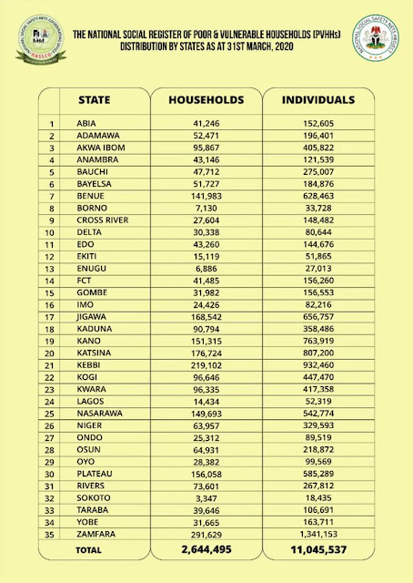
Here our statistical variable is going to be the table on Nigeria Poor & Vulnerable Households provided by "The National Social Register of Poor & Vulnerable Households (PVHHs)" as of 31st March, 2020.


There are many R packages for making and working with maps and GIS/spatial data in general. Some of them are: ggplot2, ggmap, maps, mapdata, tmap, sp, sf, rgdal, rgeos, mapproj, etc. More related packages can be reviewed on this page.

For the purpose of making the Choropleth map, I will make use of the following packages:
~  tmap (to plot the map),
~ sf or rgdal (to read shapefile as spatial data.frame) and
~ readr (to read .csv file) ( install.packages(c('tmap', 'rgdal')) ).


Choropleth map
The script below will plot a basic map based on the default attribute columns.
# For reading CSV files
library(readr)
# For reading, writing and working with spatial objects
library(sf)
library(rgdal)
# For creating map
library(tmap)


# Read the CSV data...
# Note missing data for: Ebonyi and Ogun states
Poor_and_Vulnerable <- read_csv("C:/Users/Yusuf_08039508010/Desktop/Working_Files/Fiverr/2021/08-August/R Poor and Vulnerable/Poor and Vulnerable.csv")

# Read the NIG Admin shapefile... using sf
ng_map1 <- st_read('C:/Users/Yusuf_08039508010/Desktop/Working_Files/Fiverr/2021/08-August/R Poor and Vulnerable/SHP/NIG_ADM.shp')


# Read the NIG Admin shapefile... using rgdal
# ng_map2 <- readOGR("C:/Users/Yusuf_08039508010/Desktop/Working_Files/Fiverr/2021/08-August/R Poor and Vulnerable/SHP", "NIG_ADM")


colnames(ng_map1)

# Quick base R plot...
plot(ng_map1) # by all columns
plot(ng_map1['geographic']) # by column name
plot(ng_map1['geometry']) # by column name


# Simple plot using tmap...
tm_shape(ng_map1) + 
  tm_polygons(col='geographic')

Note that: I was facing this error: https://github.com/mtennekes/tmap/issues/571, so I downgrade sf from version 1.0.0 to 0.9.8
# Installing specific version (0.9.8) of sf package... www.support.rstudio.com/hc/en-us/articles/219949047-Installing-older-versions-of-packages
# Saerch for specific package at: https://cran.r-project.org/src/contrib/Archive/

packageurl <- 'https://cran.r-project.org/src/contrib/Archive/sf/sf_0.9-8.tar.gz'
install.packages(packageurl, repos=NULL, type="source")


However, the map we wanted is based on a dataset which is in a CSV file we read into a variable named "Poor_and_Vulnerable". So we have to find a way of combining the CSV data to the map to be able to plot the choropleth map showing the Poor & Vulnerable Households/Individuals in Nigeria.

The process is very simple using the merge() function as follow;-

# Merge the CSV data to the Shp data...

# Check the col names for both the CSV and shp data...
names(Poor_and_Vulnerable)
names(ng_map1)

m <- merge(ng_map1, Poor_and_Vulnerable, by.x='state_name', by.y='State')

names(m)


# Plot choropleth map by Households using tmap...
tm_shape(m) + 
  tm_polygons(col='Households')

 
# Plot choropleth map by Individuals using tmap...
tm_shape(m) + 
  tm_polygons(col='Individuals')
We just need to lookup the merge/common column names and provide is as an parameter in the merge() function. We will then plot the new merged object (m) as it is called above.


Note that after the merge some states were missing. One reason for this could be because of missing record or mismatch names between the two columns.


Bubble map

A bubble map uses circles of different size to represent a numeric value on a territory. It displays one bubble per geographic coordinate, or one bubble per region (in this case the bubble is usually displayed in the baricentre of the region).

It takes few lines of code to make bubble map using tmap as seen below...

# Bubble Map....
tm_shape(ng_map1) + 
  tm_polygons(col='black') + 
  
  tm_shape(m) + 
  tm_bubbles("Households", col='red')


If you are interested in traditional GIS graphical approach of producing similar maps, check this post on 'Mapping Poor And Vulnerable Nigerians by state', where I used QGIS to produce similar maps.


Happy mapping!
Tuesday, August 24, 2021

Extrapolating Nigeria population by states, LGAs and wards from WorldPop database

 On WorldPop.org you will find open and high-resolution geospatial data on population distributions, demographic and dynamics, with a focus on low and middle income countries.

In this article, I will explain how to get population counts for states, LGAs and wards in Nigeria. More specifically, I will use the "Constrained Individual countries 2020 UN adjusted  (100m resolution) for Nigeria".

Download the data which is in raster GeoTif format and about 59mb at the time of writing. The load the population raster together with states, LGAs and wards polygon shapefiles into QGIS project.


As seen above, the darker dots are where we have higher concentration of people (high population). Now we need to extract the pixel population values for each state, LGA and ward.


Zonal statistics algorithm 

Zonal statistics which is an algorithm that calculates statistics of a raster layer for each feature of an overlapping polygon vector layer. This algorithm can be accessed from the: Processing toolbox >>  Raster analysis >> Zonal statistics.


We will use this algorithm to calculate the sum of population value within each state, LGA and ward.


So, we just need to run the algorithm for the three polygon layers (state, LGA and ward).

Thursday, August 19, 2021

Work with Rsater data in R/RStudio

 There are several packages in R used in read and writing raster data (a GeoTIFF file). In this post, we will see a few notably tmap, ggplot, rgdal and raster.

The raster data I will use for this demonstration is this (n08_e007_3arc_v2.tif) Landsat8 image in .tif format. You can get such rasters from the USGS EarthExplorer platform or many other sources out there.

First things first is to install and import the packages if you don't have them already.

# packages <- c('raster', 'rgdal', 'ggplot2', 'tmap')
# install.packages(packages)

library(raster)
library(rgdal)
library(ggplot2)
library(tmap)


Reading and exploring the raster attributes

The read the raster file, we use the raster package. 

raster_img <- raster("C:/Users/Yusuf_08039508010/Desktop/Working_Files/IMG/n08_e007_3arc_v2.tif")

# Explore the loaded raster to get familiar with it...
class(raster_img) # 'RasterLayer' [package "raster"]
View(raster_img)
str(raster_img) # here we see that it only 1 band image
print(raster_img) # here we can find the CRS, Min/Max vaules, Extent, Dimensions etc
names(raster_img)
summary(raster_img)

By exploring the raster using the base R functions above, we already seen a lot of useful properties and information about our raster data. More metadata attributes can be accessed from the raster attribute using the @ slot symbol like this:-
crs(raster_img)
raster_img@crs
raster_img@extent
raster_img@file
raster_img@data
raster_img@rotated
raster_img@legend
raster_img@ncols
raster_img@nrows
raster_img@history
nlayers(raster_img)# Tells if the raster is "Single Layer (or Band) vs Multi-Layer (Band Geotiffs)"
The lines above are self explanatory, feel free to explore them and use them.


Visualizing the raster

Lets use the base R plot function to quickly visualize the image raster.

plot(raster_img)

The line above should yield this figure below:-


Monday, August 16, 2021

Using Easting and Northing coordinates to plot survey site plan in AutoCAD

  Assuming you conducted a field survey with a GPS or similar instrument that allows us to generate the following record listed of coordinates.

It is expected that we plot the coordinates to scale using AutoCAD software.

The site reconnaissance diagram is provided below:-


Recce (reconnaissance) diagram - source: author site inspection


Now, we want to plot this data to scale using AutoCAD. Here are the steps you need to follow:-


Step 1: Launch AutoCAD software and Setup the drawing units.

Open the units dialog box by typing "UNITS" and set the values as per your data as seen below.


Remember to check the "Clockwise" button and set "Direction" to North. This because survey bearings are measured in clockwise direction from the north pole.


Step 2: Next is to prepare and plot the data using an expression as seen in the sample output box above.

The expression is like so: Easting,Northing that is: 355295.411,942748.140 for the first point P1.

The complete expression will look like this:-

355295.411,942748.140
355265.635,942751.796
355295.983,942774.665
355301.938,942773.934


Step 3: Pick LINE command and type the expressions above one after the other.

Alternatively, you could copy paste the entire expressions after picking line command. This will plot the entire lines on the fly.

Note that you can use circle or point command instead of using the line command.


That is it!

Saturday, August 14, 2021

Using Bearing and Distance to plot survey site plan in AutoCAD

 Assuming you conducted a field survey with compass or similar instrument that reads bearing to generate the following record listed below.

The table above is assumed to be the final corrected observations for our plotting. If you made a mistake in your field measurements, there are several ways to apply corrections to the measurements which is outside the scope of this article.

The site reconnaissance diagram is provided below:-


Recce (reconnaissance) diagram - source: author site inspection


Now, we want to plot this data to scale using AutoCAD. Here are the steps you need to follow:-


Step 1: Launch AutoCAD software and Setup the drawing units.

Open the units dialog box by typing "UNITS" and set the values as per your data as seen below.


Remember to check the "Clockwise" button and set "Direction" to North. This because survey bearings are measured in clockwise direction from the north pole.


Step 2: Next is to prepare and plot the data using an expression as seen in the sample output box above.

The expression is like so: @Distance<Bearing that is: @30.00<277d00'00" for the first line P1-P2.

The complete expression will look like this:-

@30.00<277d00'00"
@38.00<53d00'00"
@6.00<97d00'00"
@26.60<194d12'00"


Step 3: Pick LINE command and click anywhere on the drawing area and type the expressions above one after the other.


Alternatively, you could copy paste the entire expressions after picking line command and clicking on the drawing canvas. This will plot the entire lines on the fly.


That is it!

Friday, August 13, 2021

Common AutoCAD Commands for Survey Plan Drawing

 AutoCAD has literally hundreds of command for different professionals. In this article, we will look at some commonly used commands as related to the surveying profession most specifically for drawing survey site plans.

Lets start with the first command...


1) VIEW MENU

Under this menu, we can customize the interface of our AutoCAD by displaying different panels as seen below.


The most important panels for surveyors are: CommandLine, Properties, User Coordinate System (UCS) Icon, View Cubet, File tab, and Layout tab.


2) OPTIONS

This command allows us to do many settings. As seen below, there are many tabs where you can configure different settings as seen.


For example under the "Display" tab, you can configure color scheme, crosshair size etc. Under "Open and Save" tab, you can configure default version to save your drawings etc. Under "Plot and Publish" tab, you can configure default printer, plot location etc.


3) UNITS

As a surveyor, you need special settings for drawing units and angles.


We want our angles to read in Degrees/Minutes/Seconds from the North direction. And our distances be read in meters.

Saturday, August 7, 2021

Convert dataframe column of strings to lists and vice versa

Dataframe columns will commonly load as object/string type. However, if you want separate the rows into individual columns using this expression df = df_melt['col_name'].apply(pd.Series) then there is a need to convert the column of strings to lists.

Read the data into a dataframe. Here we got multiple languages under the language column that we want to convert into list for further analysis.


So, for each row/cell what we have is something like this ('English\nCantonese\nMandarin\nFrench') and what we wanted is this (['English', 'Cantonese', 'Mandarin', 'French']), vice versa.

# Convert 'String' column to list... Another solution: df_melt = df.assign(Language_list_melt = df.Language.str.split("\n"))
def str_to_list(a_str, seperator='\n'):
    return a_str.split(seperator)

df['Language_list'] = df['Language'].apply(lambda x:str_to_list(x))
# -------------------------------

# Convert 'List' column to string...
def list_to_str(a_list):
    return ", ".join(a_list)

df['Language_str'] = df['Language_list'].apply(lambda x:list_to_str(x))

That is it!

Tuesday, August 3, 2021

GIS data wrangling with python - case study of 'African Journals Online' featured countries

 Real world GIS data are usually messy and you have to wrangle and clean them before a GIS software can take them in to make useful analysis.

Of course, the data wrangling process can be done manually but when you have a very large data with complex and messy structure then 'Python GIS data wrangling' is the sure way to go.

In this post, we will take a look at the following case study of 'African Journals Online' featuring countries. This online journal features 33 African countries as listed on the website and it is require we visualize those countries on a map of Africa.


As you can see the data is fairly simple to prepare by hand, but we will use python so we can develop our skill and be prepared for more complex data.

The data we are interested in are the country name and the number of publish articles. For example, Algeria (5) means country name is Algeria and it has 5 number of publish articles.


Step 1: Copy the data into python

There are several ways we can use to achieve this. The easiest is to copy it into a spreadsheet file as seen below...


Then we can read the data and wrangle/clean it into the format for GIS use.


import pandas as pd

aoj_df = pd.read_excel("aoj.xlsx")
aoj_df['AOJ']


Step 2: Write function to clean the data

A good starting point is to pick just one record and wrangle it before applying the solution to all other records.

aoj_df['Country'] = aoj_df['AOJ'].apply(lambda x : x.split('(')[0].strip())
aoj_df['NumberOfArticles'] = aoj_df['AOJ'].apply(lambda x : x.split('(')[1].replace(')', '').strip())
aoj_df


Step 3: Export the data into a spreadsheet

Since the resulting data will be use in GIS environment, we have to save it to file we can import into QGIS/ArcGIS or any GIS software we want to work with.

# Save to file...
aoj_df.to_excel('aoj_cleaned.xlsx', index=False)

Our data is now ready for GIS analysis.


Using the data

To use the data above, I made use of QGIS to join the spreadsheet to an African shapefile map. But there was an issue with the following counties ('Congo, Democratic Republic', 'Congo, Republic', 'Côte d'Ivoire', 'Egypt, Arab Rep.', 'Eswatini', 'South Sudan', 'Tanzania') either their names where differently spelt on both the spreadsheet and the shapefile or the country doesn't exist on the map.


How to wrangle both data to lookup the difference was explained on this post: PyQGIS Shapefile attribute lookup. Refer to the post to use python in QGIS to wrangle the data.

Basically, we need to compare two lists one for the map countries and the second for the AOJ spreadsheet countries to find out which countries will be missing from the join operation as listed above. The resulting code should look like the one below:-

# Select active layer for both map and spreadsheet...
map_layer = iface.activeLayer()
spreadsheet_layer = iface.activeLayer()

# Get map column attribute into list
map_countries = []
for feature in map_layer.getFeatures():
    map_countries.append(feature['PLACENAME'])

# Get spreadsheet column attribute into list
spreadsheet_countries = []
for feature in spreadsheet_layer.getFeatures():
    spreadsheet_countries.append(feature['Field2'])

# Comparing the countries list...
missing_countries = []
for country in spreadsheet_countries:
    if country not in map_countries:
        print(country)
        missing_countries.append(country)

As you can see, these  ('Congo, Democratic Republic', 'Congo, Republic', 'Côte d'Ivoire', 'Egypt, Arab Rep.', 'Eswatini', 'South Sudan', 'Tanzania') countries names would have to be adjusted to match both the shapefile map and the spreadsheet data.


You can do this adjustment manually, however if you want to try editing them with python feel free to do so.

Hint: You can use the replace() function to complete this.


That is it!