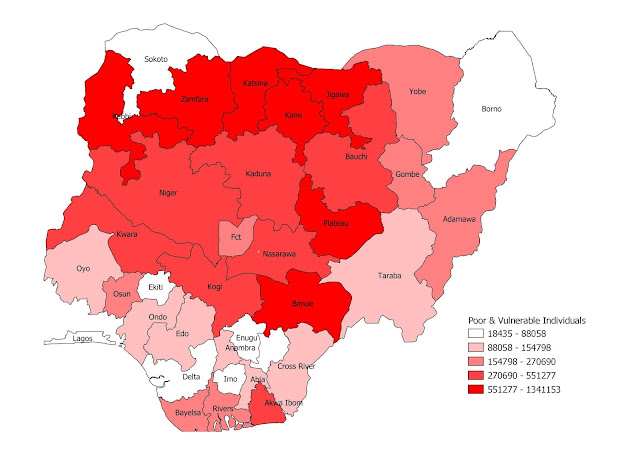
In this post, I will visualize the table below on a map. The types of map we will produce will include Choropleth map, Proportional Symbol map etc.
The table is on Nigeria Poor & Vulnerable Households provided by "The National Social Register of Poor & Vulnerable Households (PVHHs)" as of 31st March, 2020.
Note that some few states (Ebonyi and Ogun states in this case) are missing from the record.Preparing the Choropleth maps
I will use QGIS software to map this data by following these steps listed below:-
- Convert the table above to a CSV file and load it into QGIS
- Get Shapefile map of Nigeria states from GADM or Diva-GIS and load it into QGIS
- Join the two layers above based on the state name column
- Make sure the joined attribute columns (Households and Individuals) are numeric/integer columns. You can use the 'Refactor fields' algorithm to edit the structure of the attributes table.
- Next use the fields (Households and Individuals) to symbolize the map using graduated symbols.

Obviously, for this kind of map, you will edit the key/legend number range to the nearest thousands. I decided to leave the default since this is just for demo purpose.
Preparing the Proportional Symbol maps (aka bubble maps)
I will still use the QGIS software to this map. The steps are as follow:-
- From the joined shapefile layer above, generate the centroid of the polygons and export the table to CSV file so we can add it back a point layer. The expression are as follow:- Longitude is: x( centroid($geometry) ) and Latitude is: y( centroid($geometry) ). Fill free to use any method that works for you, all that is required here is to have the Households and Individuals table linked to a point shapefile instead of a polygon shapefile as in the above.
- With the point layer loaded, we can now generate the proportional map based on the Households and Individuals fields
To accomplish this proportional map, you need to work on the point size settings under: Single symbol >> Simple maker >> Data defined override >> Assistant
To set the legend, you also need to setup the "data-defined size legend" as shown below.
Poor & Vulnerable Households
Poor & Vulnerable Individuals
I think adding the states' name as labels will help as seen below. Feel free to play around with the map element and styling to suit your map purpose.
Data Sources:
1) https://dailypost.ng/2020/04/10/covid-19-zamfara-leads-as-fg-publishes-full-list-of-11-million-poor-and-vulnerable-nigerians/
2) https://www.nairaland.com/5786773/11-million-poor-vulnerable-list


No comments:
Post a Comment